Rapid prototyping to modernize the State of Colorado's website in 2 days
CO.gov | 2025 | 2 days
Role: Designer
Team: 1 UX designer, 1 UX researcher
Tools: Figma
A high-fidelity prototype that went from concept to stakeholder pitch in 48 hours, and led directly to more paid work for my team.
Problem
The State of Colorado's website was outdated and buried information that citizens actually needed. It wasn't organized around who was visiting or what they were trying to do. Residents, businesses, and visitors all saw the same undifferentiated homepage, making it hard to find anything relevant to their specific situation.
THE CONSTRAINT: our consulting team was already working with this client, and they asked us to propose a modernized design within a few days to pitch to stakeholders.
My Role
As the designer on this rapid prototyping sprint, I owned the work end-to-end, from low-fidelity wireframes grounded in a competitive audit, through two rounds of hi-fidelity iteration based on stakeholder feedback, to the final prototype used to pitch and sell the redesign.
Wireframes, Grounded in Research
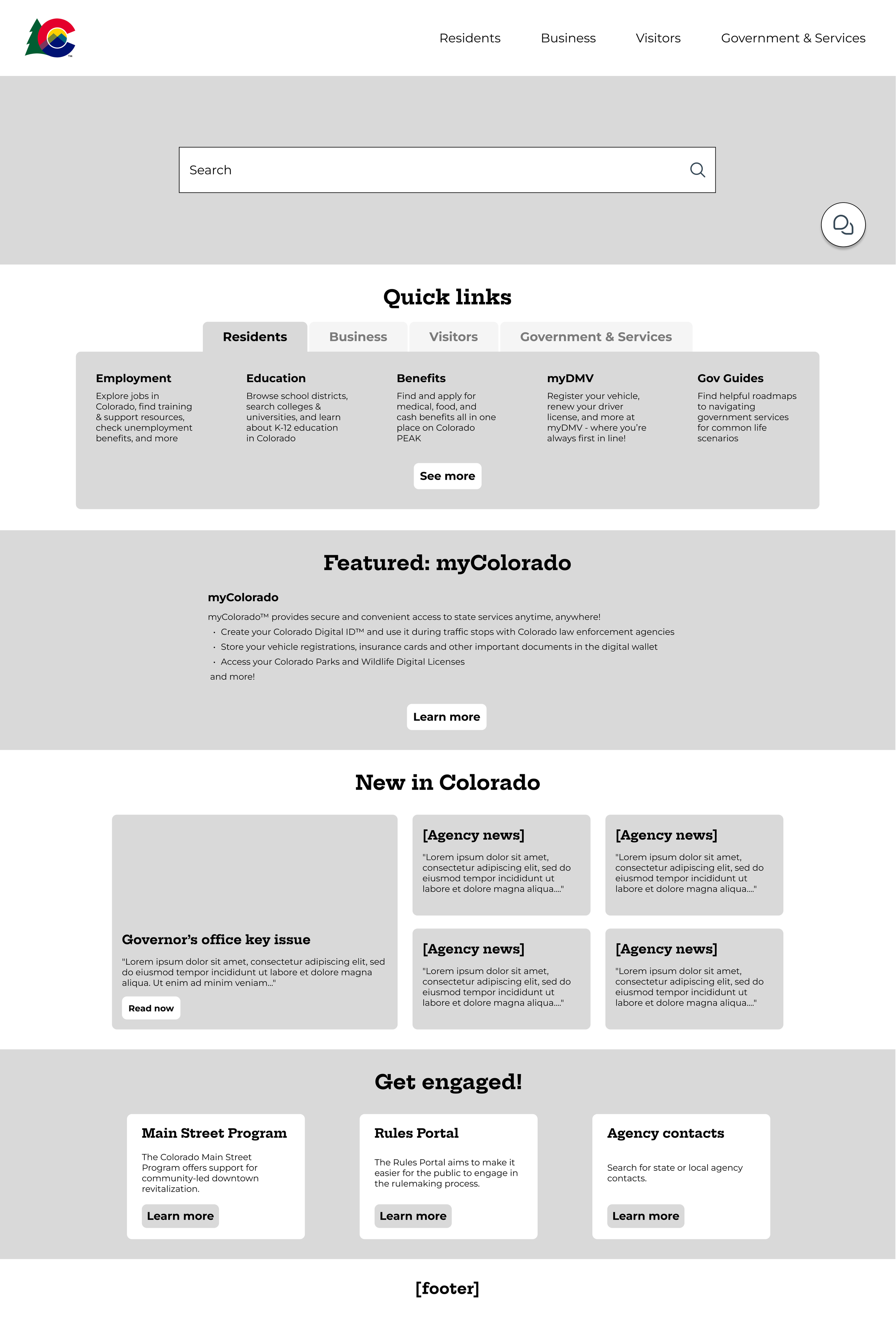
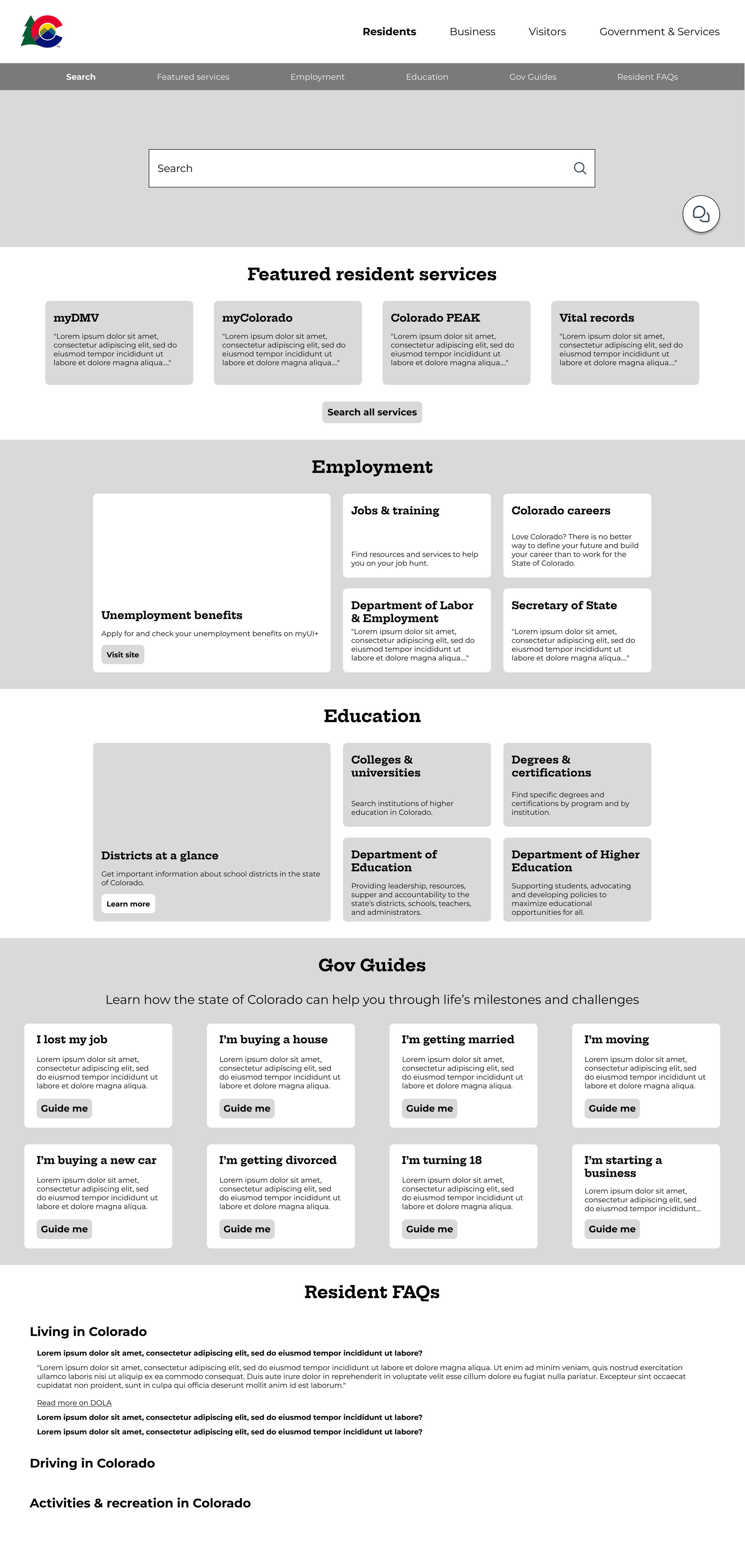
I started from a competitive audit a fellow designer had done on other government website layouts, and used it to explore a more information-dense homepage that was organized into clear categories (Quick Links, Featured, and News) and split by user type (Resident, Business, Visitor, Government). Stakeholders responded well to this direction, which gave us confidence to move straight into high-fidelity design.
Round 1: Testing the wireframes' structure in high fidelity
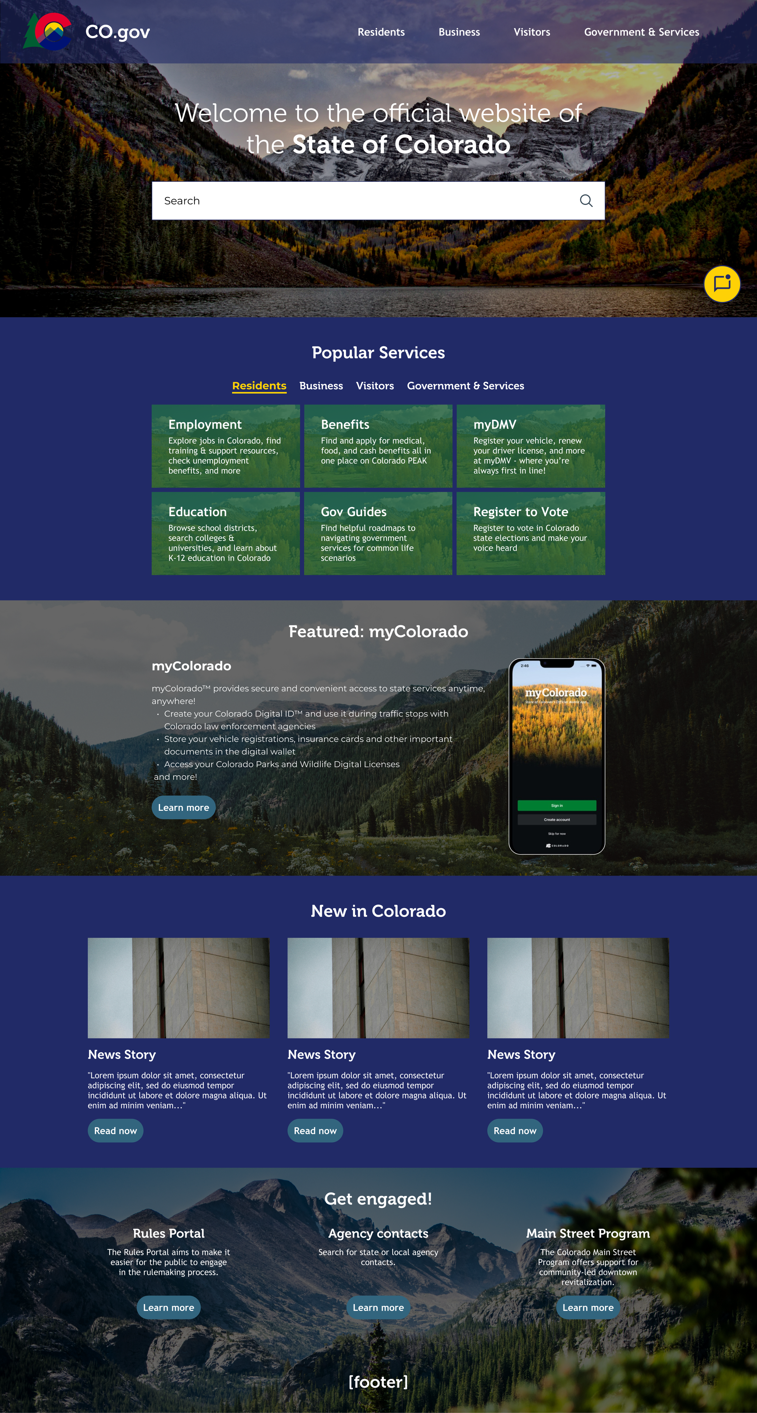
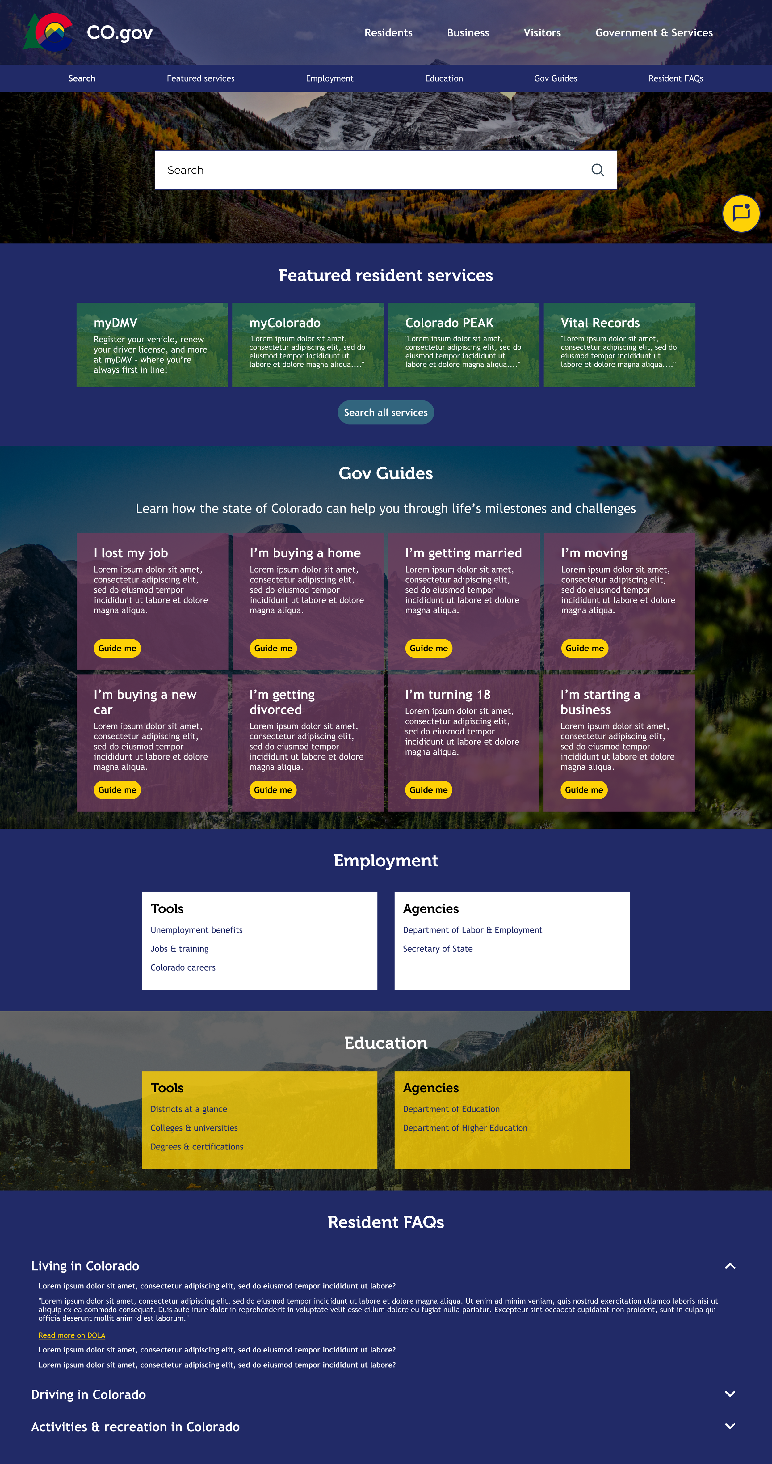
The first high-fidelity pass followed the wireframes closely and stuck to the state's existing brand colors.
Feedback from stakeholders:
Too boxy and dark
Didn't need to lean so heavily on brand colors
Use the wireframes as a content guide only—not a literal layout to follow
Round 2: A completely different concept
Rather than patch the first version, I went back to the drawing board with a new concept:
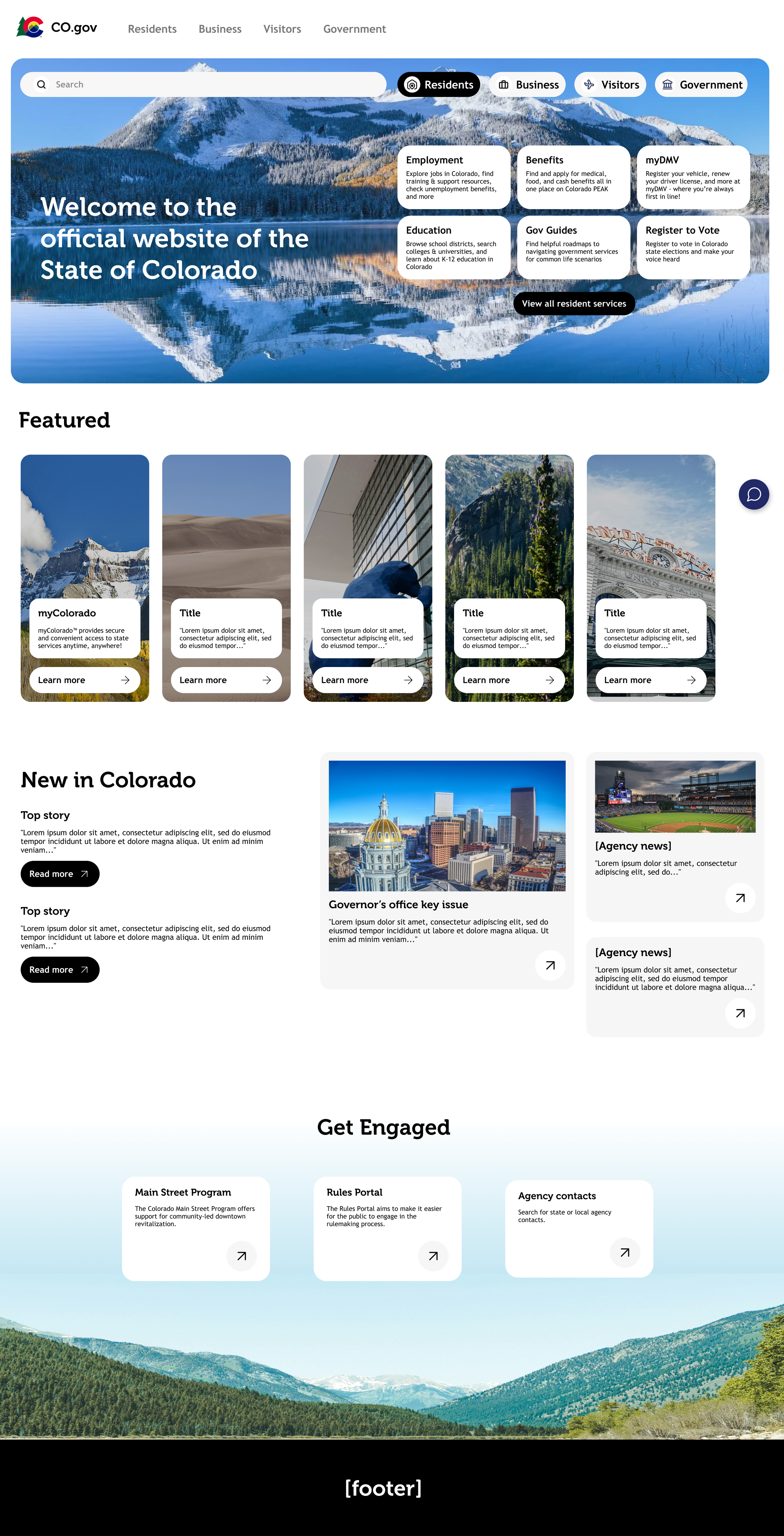
Removed the heavy brand colors
Introduced rounded, softer edges throughout
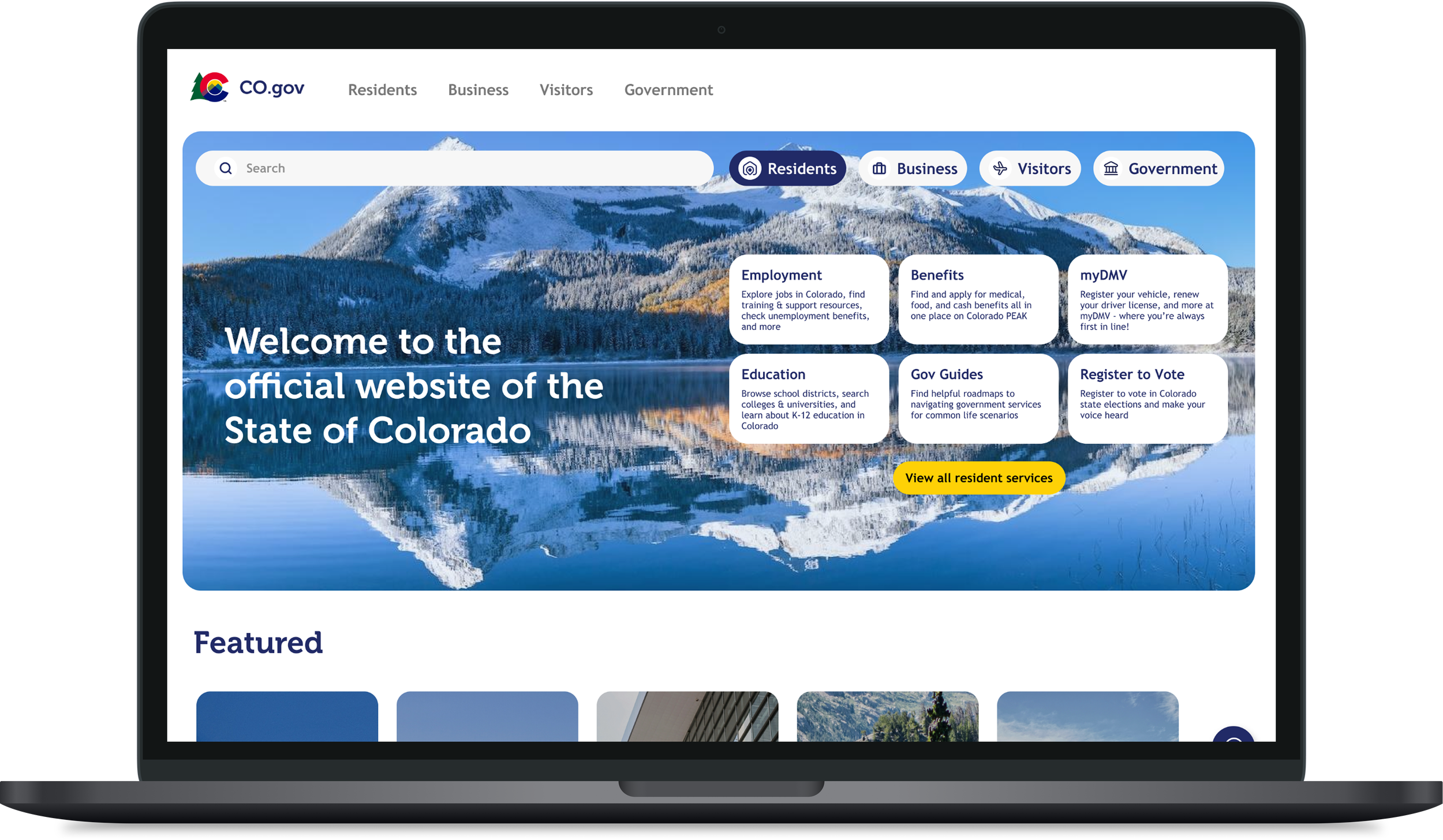
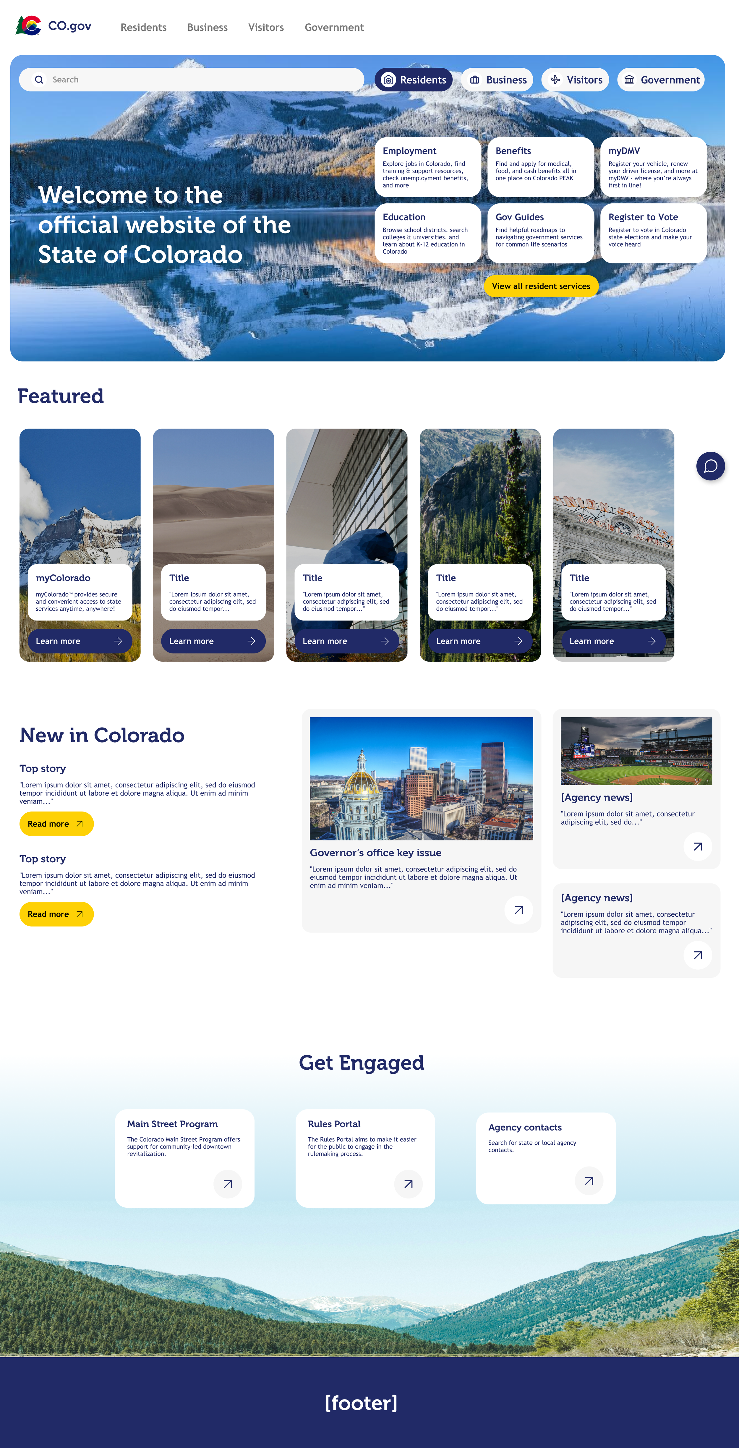
Built an interactive top section where a user selects their type (resident, business, visitor) and the content below dynamically changes to match, turning a static homepage into something that responds to who's actually using it.
This landed well with no major feedback, so I used the remaining time to refine the details further.
Final Iteration: Bringing the brand back in deliberately
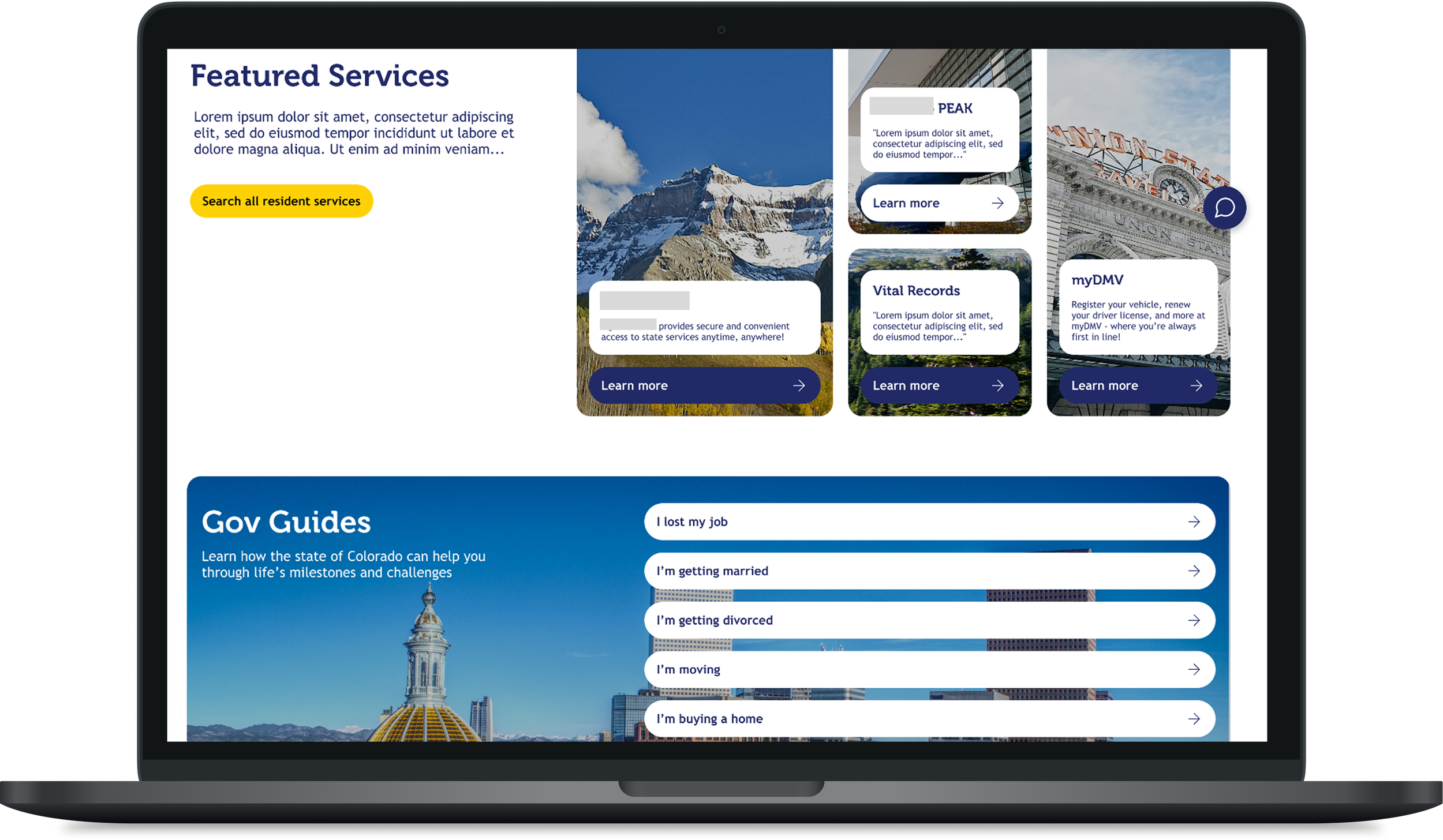
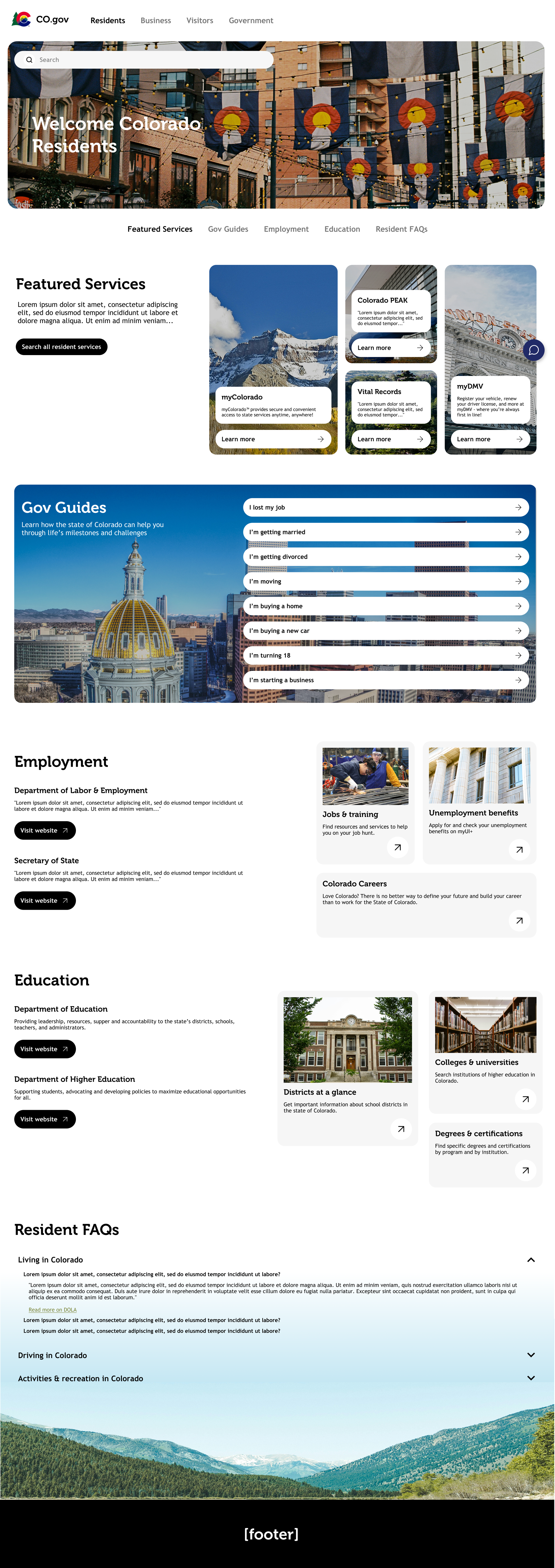
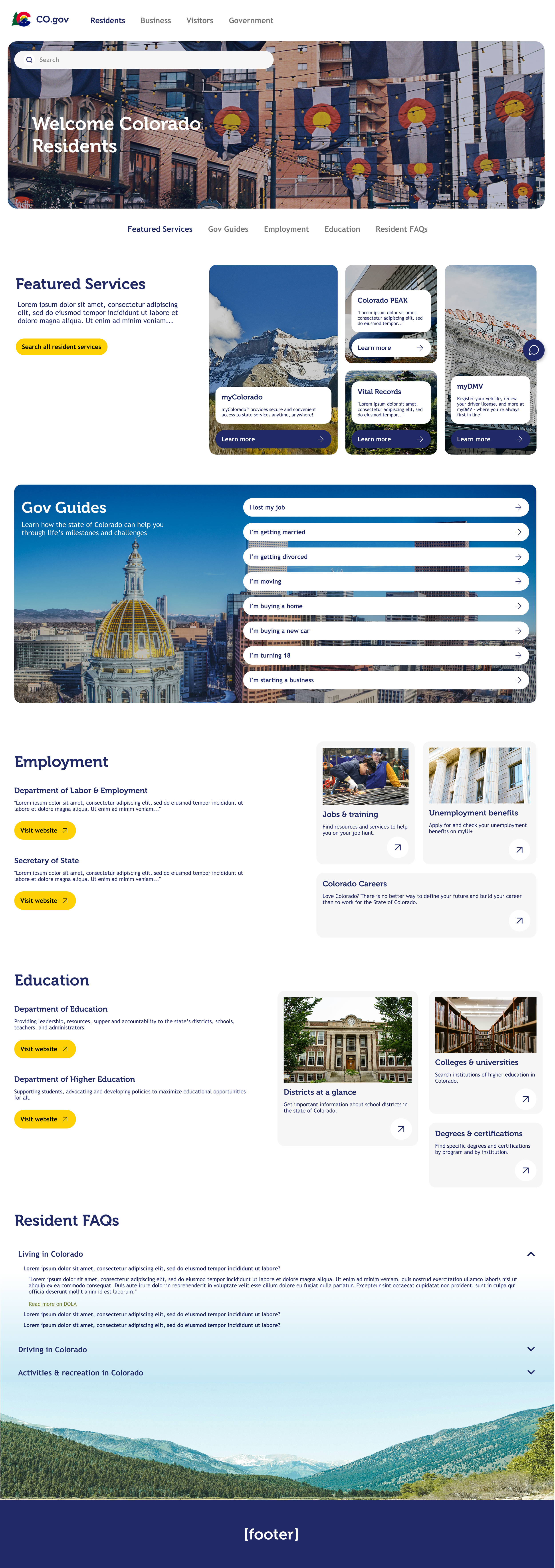
For the final version, I reintroduced Colorado's brand colors in a more subtle way, enough to give the design some life and make it feel distinctly "Colorado" without repeating the boxiness of Round 1. I also built a working prototype.
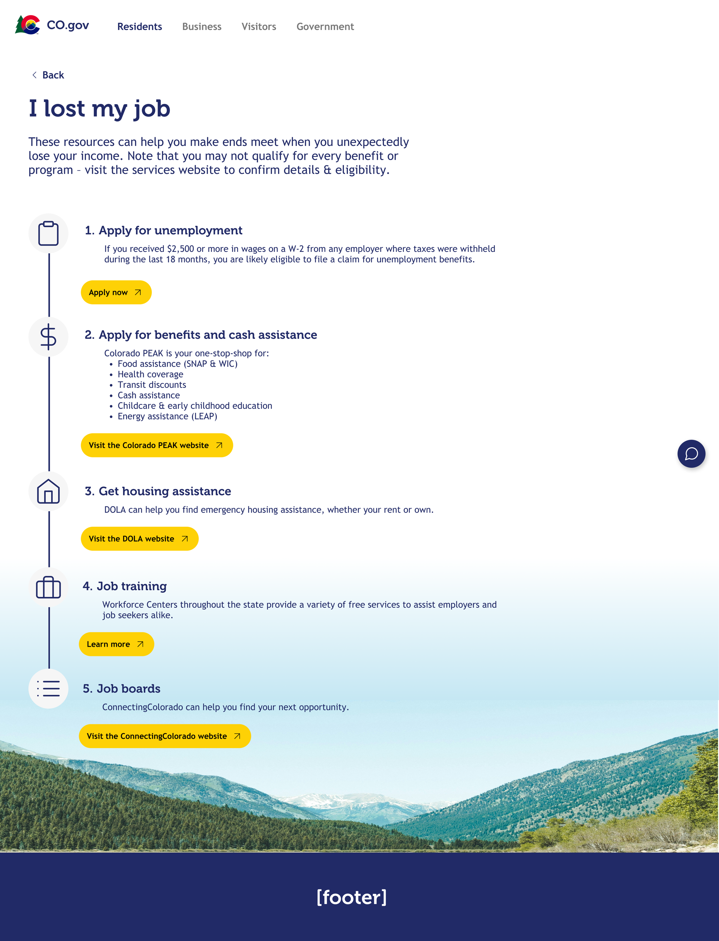
An example Gov Guide sub-page ('I lost my job')
Outcome
This wasn't just an exercise, the high-fidelity prototype was pitched directly to stakeholders and sold, resulting in additional paid work for my team. In two days, the design went from concept to a deliverable that generated real business value for the client relationship, proof that fast turnaround and thoughtful design aren't mutually exclusive.