Building a marketplace from scratch for a sport with nowhere to buy or sell boats
Freelance (Top Mark) | 2026 | 12 weeks
Role: Product Designer, Website Builder, Copywriter
Team: 1 Product Designer
Tools: Figma, Wordpress, Listivo, Elementor, WooCommerce, Google Maps API, Claude
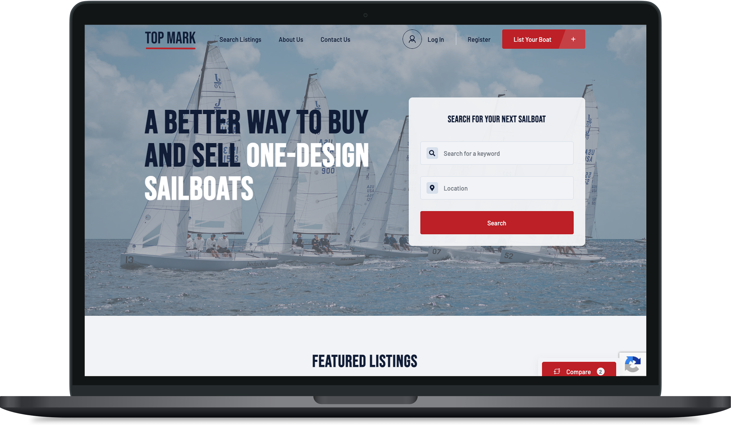
Top Mark is a live marketplace for one-design sailboats that was designed, built, and launched by me, end to end, and got real customers within the first week.
Problem
There was no dedicated marketplace for buying and selling one-design sailboats (boats built to strict, identical class specifications). Because buyers for these types of boats care about class-specific details, a generic boat listing site doesn't meet their needs. Instead, sellers were stuck posting in a patchwork of Facebook groups, Craigslist, and general boat-sale sites that weren't built for how one-design sailors actually need to search for and compare boats.
My Role
I owned this project end to end: choosing the platform, designing the visual identity and site structure, writing the copy, and building the entire live site myself—from the homepage to the listing forms, payment packages, and search experience.
Initial Conceptualizing
Grounding decisions in a competitive audit
Before designing anything, I looked at how sailors currently search for and list boats: Sail1Design, Facebook Marketplace, Craigslist, YachtWorld, and Melges. I wasn't deciding whether this marketplace should exist, the client had already made that call, but this audit shaped a lot of the design decisions that I made: what information a listing needed, how search and filtering should work, and where existing sites felt cluttered or lacked modernity.
Choosing a platform with Claude as a research partner
The client wanted a subscription-based paywall for posting listings, so before any design work started, I used Claude AI to research and compare no-code classifieds platforms: Yclas, Brilliant Directories, and WordPress with the Classima theme. I weighed each on cost, design flexibility, and how well each could handle subscriptions.
Yclas was cheapest and fastest to launch, but its design capabilities were more limited and subscriptions were a secondary feature. Brilliant Directories was the most ready-to-use and handled subscriptions natively, but it was a closed platform, meaning the client would never be able to migrate the site somewhere else if they chose to. WordPress had the steepest learning curve and the most setup work—hosting, theme, Elementor, WooCommerce—but it gave the us full ownership of their site and data, the most design freedom, and room to grow later without a platform migration.
I recommended WordPress. Since I hadn't built a WordPress site from scratch before, I used AI to walk through the setup step by step—buying the domain, choosing hosting, installing WordPress, and adding the theme.
Once inside WordPress, I initially built it using the Classima theme, but pivoted to Listivo when Classima proved too rigid for the customization I still wanted to make to the template.
Designing the visual identity with Claude Design as a creative collaborator
I used Claude Design as a brainstorming partner throughout the visual identity process.
For the look and feel, I went through several rounds and landed on a bolder red/white/navy palette that felt like performance sailing. (Note that the logo live on the site today is still a placeholder and final direction is still in progress.)
I used the same iterative process with Claude for typography, comparing pairings like Barlow Condensed with Barlow, and Bebas Neue with Jost, before settling on a direction that felt performance-oriented without reading cold.
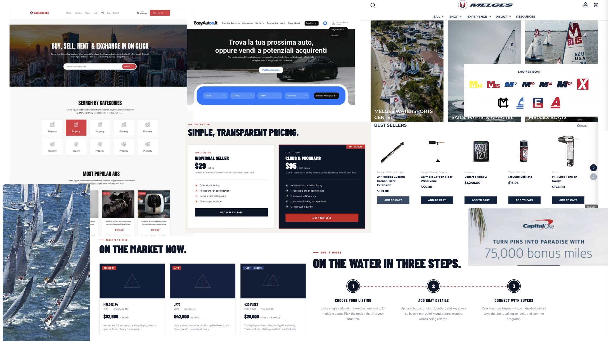
Site moodboard I used to have Claude Design create an initial concept
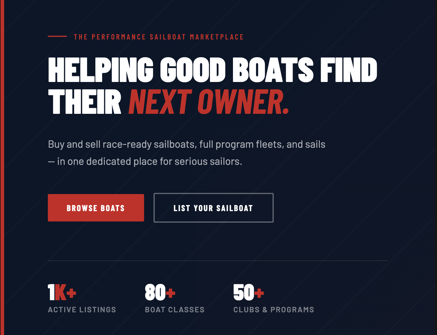
Initial concept for site from Claude Design based on my prompt and uploaded materials
Design & Build Process
Designing for mobile-first
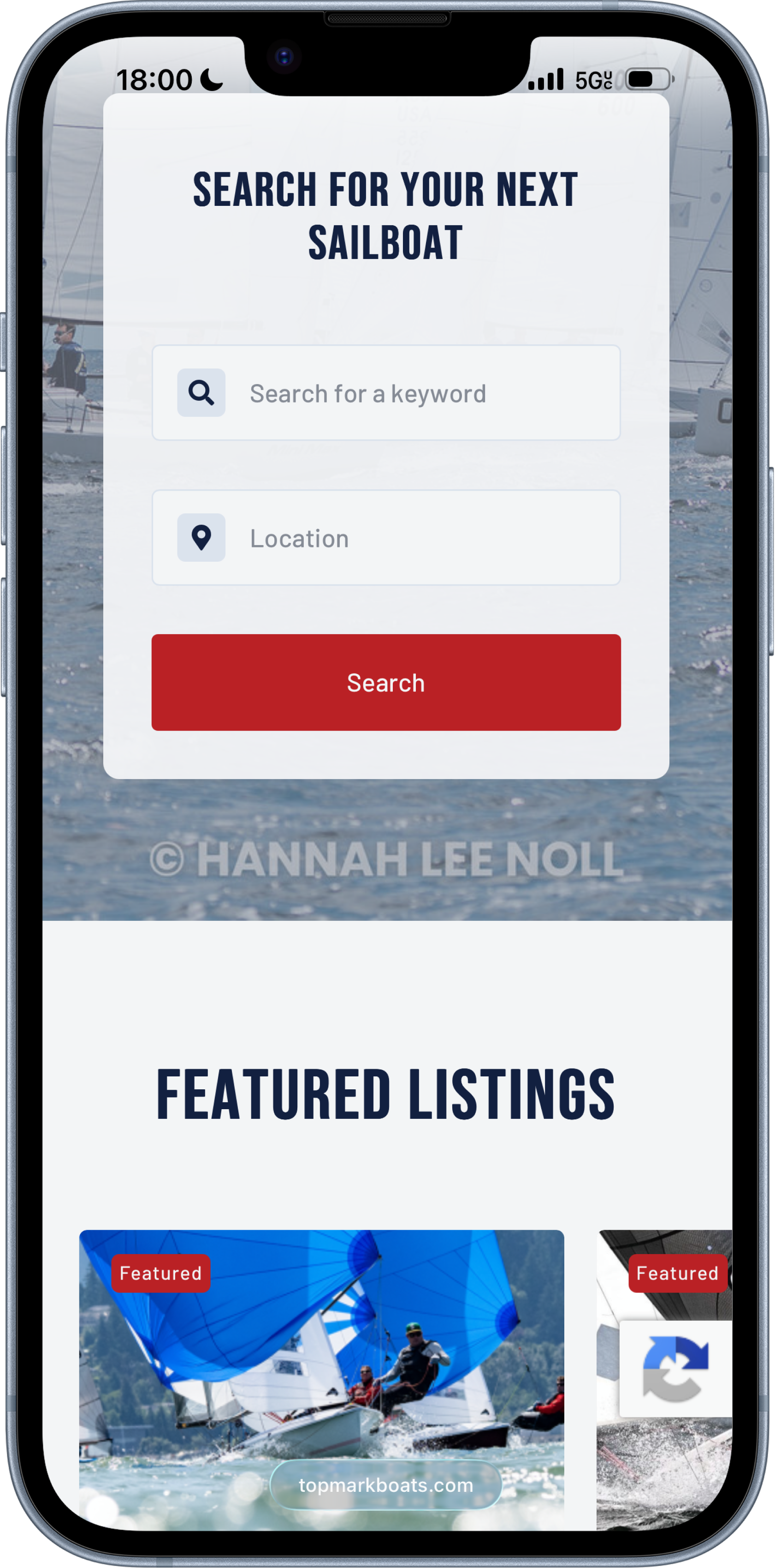
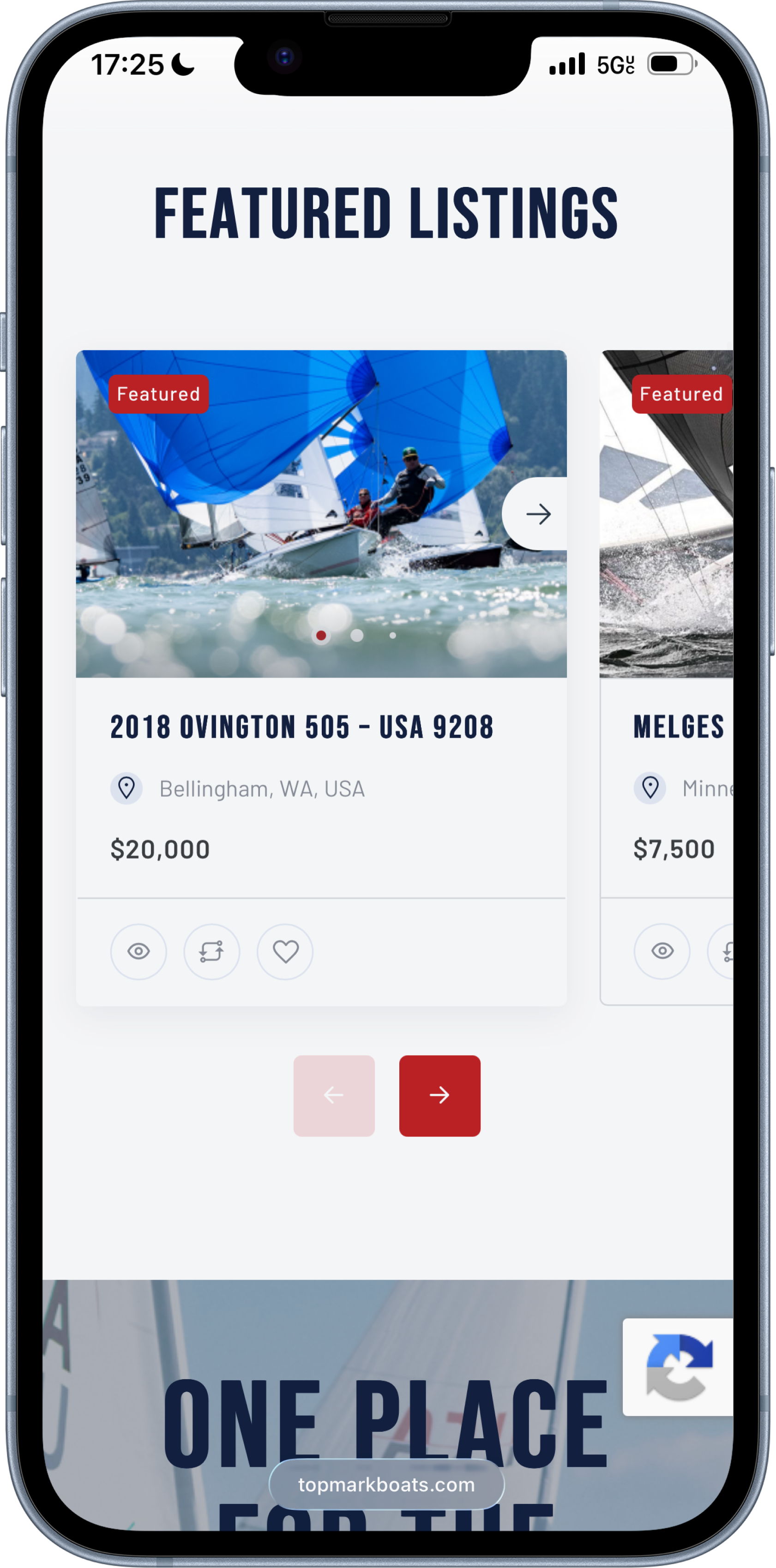
Since most sailors were likely to browse and list boats from their phones (since that’s where they would take and upload photos from), I designed the site with a mobile-first mindset. That meant prioritizing easy-to-tap search and filter controls, a listing form that stayed usable on a small screen, and ensuring the landing page was optimized for mobile. Desktop was designed as an expansion of the mobile experience, not the other way around.
Iterating with the client
Because the client was also the subject-matter expert on one-design sailing, I treated her feedback as a core part of the design process rather than a final sign-off step. We checked in weekly throughout the build, sharing designs early and adjusting based on what mattered to sellers and buyers in this specific niche.
For example, I'd originally planned a simpler, cheaper search experience where buyers typed in a state to filter listings by location. In one of our weekly check-ins, she pushed back and said she wanted buyers to be able to search visually on a map instead. That feedback meant taking on the added scope of integrating the Google Maps API, which I hadn't worked with before, instead of shipping the simpler version. This serves as a clear example of the client's knowledge overriding a design decision I had made.

Solving friction inside the template
With the Listivo template, I hit several constraints:
Global styling didn't always apply. Colors and fonts I set in Listivo's global design settings wouldn't consistently update across the site, so I used Claude Code to help write custom CSS to force the correct styling in the places the theme wouldn't cooperate.
The listing form needed logic. To make sure sellers filled out the right fields for their specific boat class, I built out if-then logic in the listing form so the fields shown adapt to what the seller is actually listing, instead of showing every possible field to everyone.
The homepage need to be fully customized. Listivo's default homepage layouts didn't fit what a one-design-specific marketplace needed to communicate, so I fully custom-built the homepage in Elementor, which meant taking an Elementor course to learn the tool well enough to do it right.
New technical skills. I integrated the Google Maps API for location-based search, and set up WooCommerce for payments, including building out the pricing tiers and coupon system from scratch.
Launching and finding the first users
Once the site was live, I posted through Top Mark's Instagram and reached out directly to my own sailing community to get the first listings on the platform.
Outcomes & Reflection
Key Outcomes
Within the first two weeks of launch, Top Mark had 8 listings from real sellers. The site is live now at topmarkboats.com, with a “list your boat” flow, a customizable search and compare experience, pricing packages, and a unique visual identity.
This project is the one I'm proudest to point to because nothing about it was theoretical. I made key decisions for the business while working within constraints, learned tools I didn't already know, and made the whole site end-to-end, and now real people are using it.
Final Thoughts
Top Mark is the clearest example of how I work when I have full ownership—ground decisions in research even under tight scope, know when a tool or platform isn't working and switch rather than force it, and pick up whatever new skill the project requires of me, whether that's Elementor, an API, or a payment system, rather than using "I’ve never done that before" as an excuse.
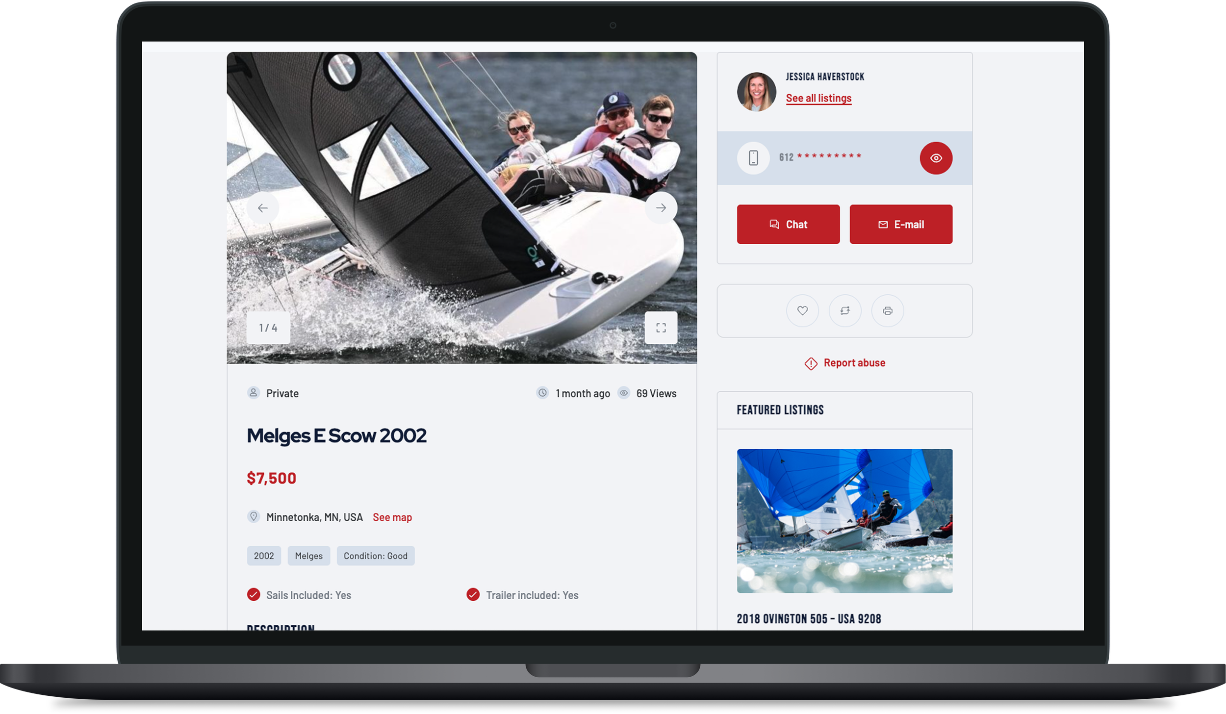
Example of a real listing on the site